About Me
Nils' professional passion is solving complex design problems that result in seamless, intuitive, and elegant user experiences. He believes that the goal of software is to make people's lives better by simplifying burdensome activities so that they can focus on more productive and enriching pursuits in their professional and personal lives.
Born and raised in San Francisco, Nils studied Architecture and Construction Management at UC Berkeley and the University of Washington where he pursued interests in computer aided design and modular construction techniques. Shorty prior to graduation, he created the Department of Construction Management's first website and has never looked back.
Nils has been an initial investor and lead front-end designer for venture-backed startups, including Jobscience, a staffing & recruitment solution, that was acquired by Bullhorn Software in 2018.
As a digital product designer, Nils has worked with customers ranging from startups and SMBs to Fortune 500 companies.
When not designing user interfaces or testing out new rapid prototyping tools, Nils can be found working on construction projects, enjoying back-country camping trips, or going on urban hikes with his wife and fantastic son.
Brands I've Worked With
Process
Nils Levine works closely with product owners, business management, technical experts, legal professionals, and end-users to foster a shared understanding of functional requirements, use cases, and customer profiles within the context of a user-centered design process.
Nils develops initial design guidelines, researches competitive offerings, and reviews current UX trends before mapping potential user journeys, paper sketches, mockups, and wireframes that evolve into a polished user experience. These initial designs are then validated by creating interactive prototypes for stakeholder review, user surveys, and A/B testing.
He ensures the success of the front-end experiences by crafting user stories and component-ready style guidelines. Improvements for future releases are identified by an active involvement in the deployment process and user acceptance testing (UAT).
2018 – 2019Western Union
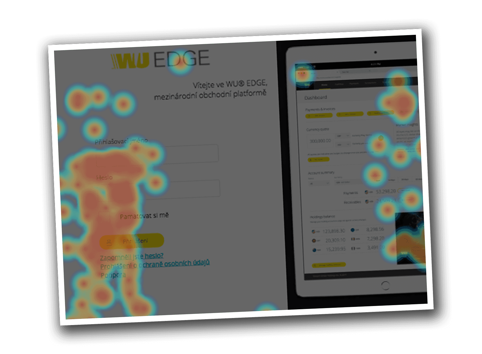
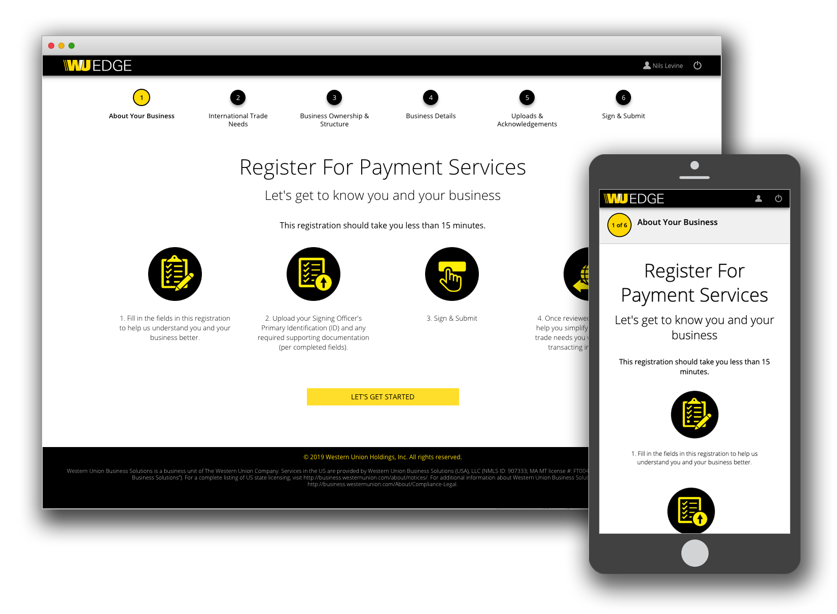
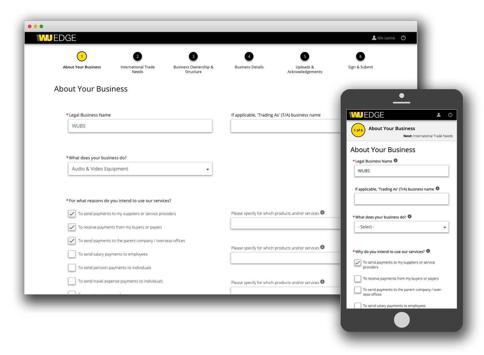
- Developed the front-end experience for the in-house WU EDGE Digital Onboarding user flow.
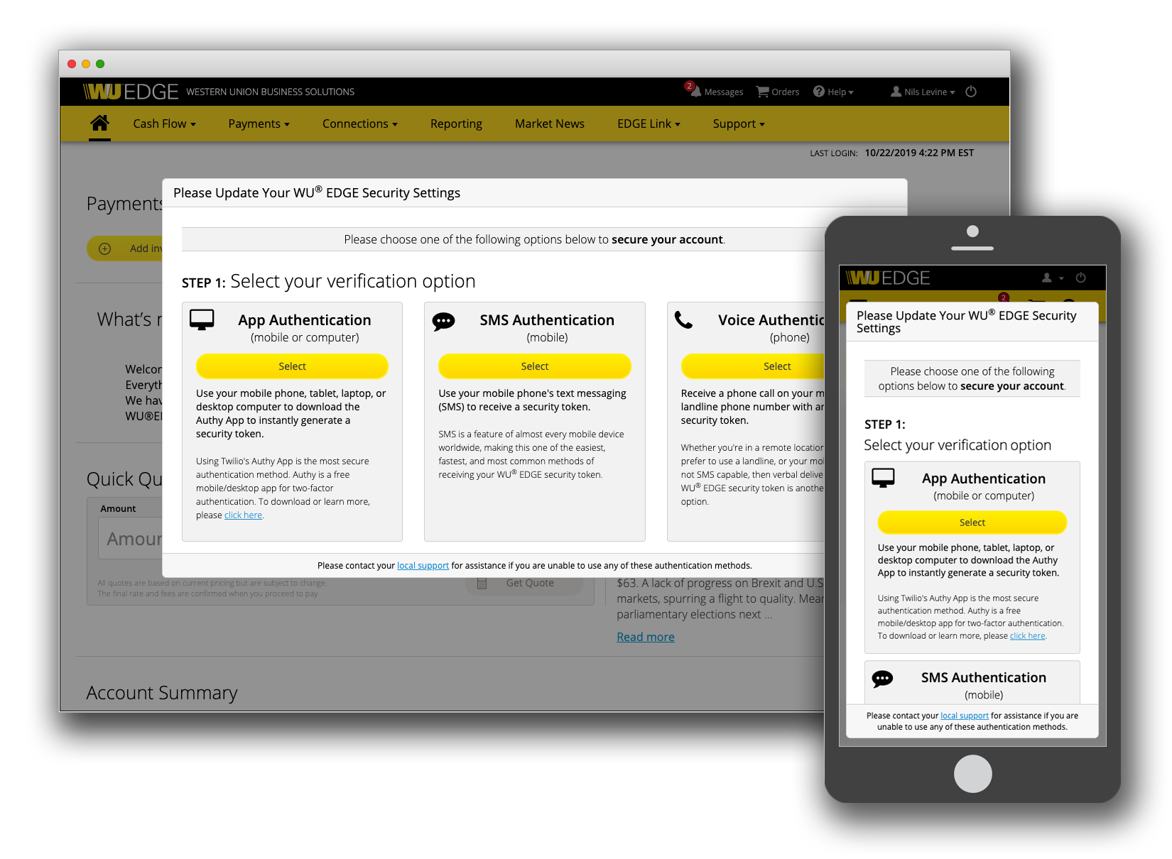
- Coded the user interface for WU EDGE's 2-Factor Authentication.
- Created the WU EDGE style guide for multiple UI frameworks (Bootstrap and Salesforce Lightning).
- Refined the WU EDGE currency calculator toolset.
- Led and iterated WU EDGE Western Union branding updates.
- Revamped the WU EDGE master UI template to accommodate multi-lingual support and mobile viewports.
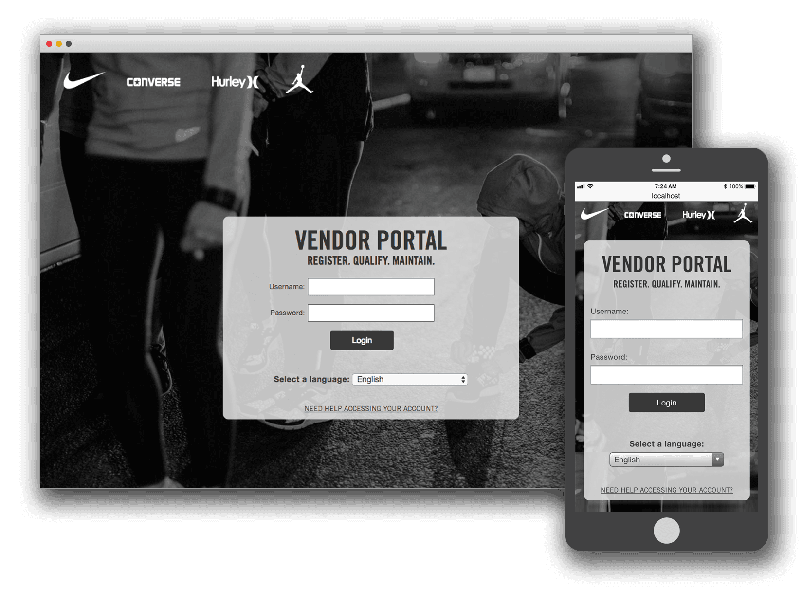
Western Union
Template & Navigation Retrofit
Introduction
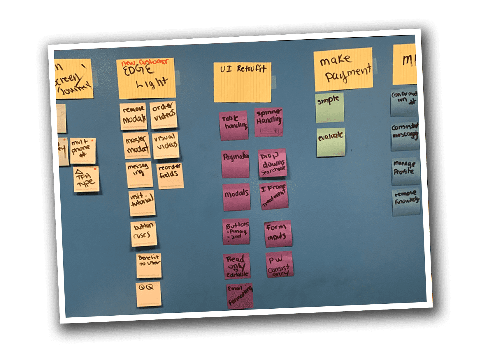
This project was my first contribution to improving the Western Union EDGE platform User Experience. It represented an opportunity to provide a big positive impact with a small amount of resources over a short period of time.
 A promotional graphic developed as part of an initiative to provide exposure to the new design.
Project Background
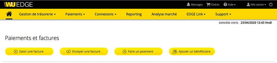
Western Union Business Solutions provides solutions to send, receive, and manage funds in 200 countries/territories and in 130 currencies.
The Western Union EDGE platform assists Small and Medium-Sized Enterprises (SMEs) in driving more visibility and efficiency with cross-currency payment processes. It was originally launched in 2016 at Money20/20 in Copenhagen, Denmark.
The Challenge
A Review of existing style guides and comments within the code base revealed that the original design criteria called for an English-only product with a specified number of navigational items. Since the products initial deployment in 2016, new features resulted in the addition of more navigational items as well as multi-lingual support.
Templates were built on HTML, CSS, and JavaScript frameworks in which I had deep applicable hands-on experience (Bootstrap and jQuery).
 The previous design had not accounted for multi-lingual support or additional menu items.
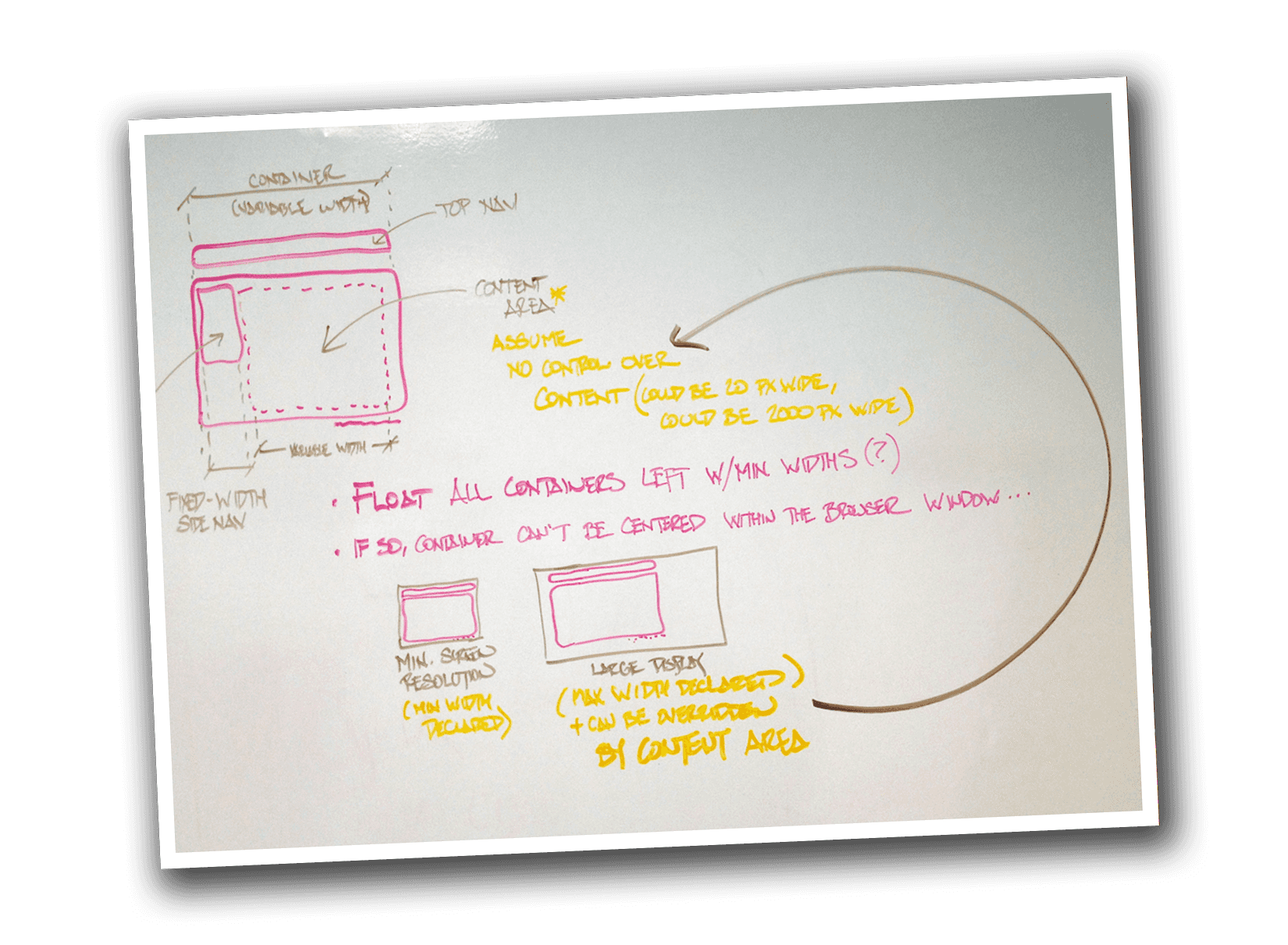
The Process
Thanks to support from engineering, I was able to quickly acquire a working knowledge of the Salesforce templating system pages, components, and static resource bundles.
I was provided with access to a Salesforce development environment where I could implement my design ideas directly in HTML, CSS, and JavaScript. This process allowed me to showcase my changes in working code for a global audience.
Design Decisions
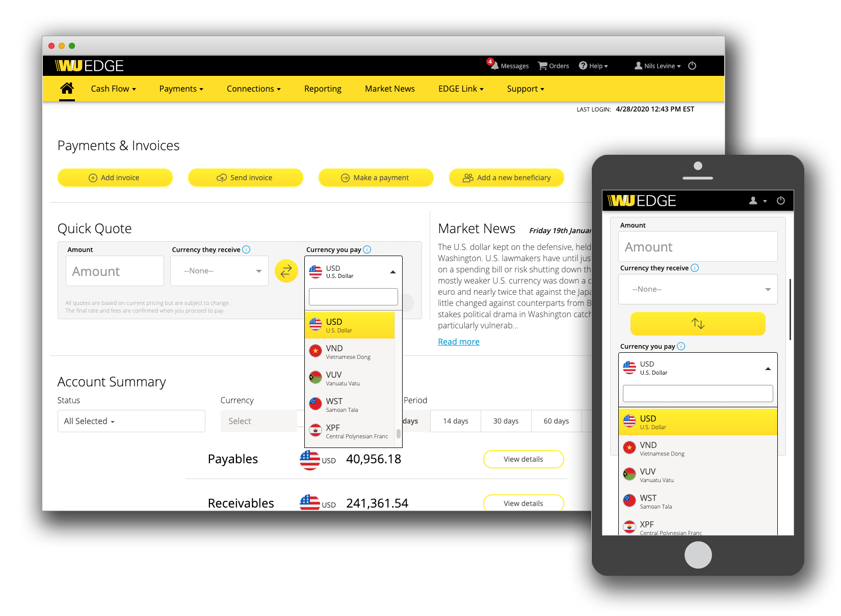
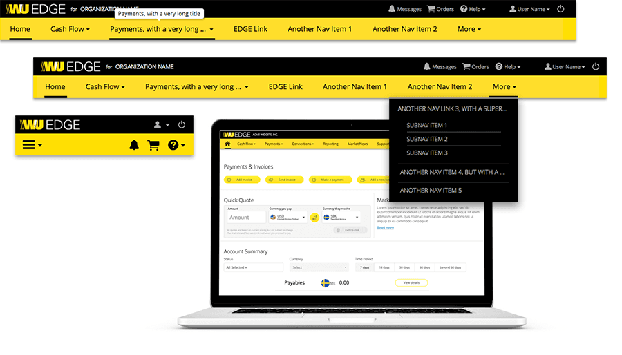
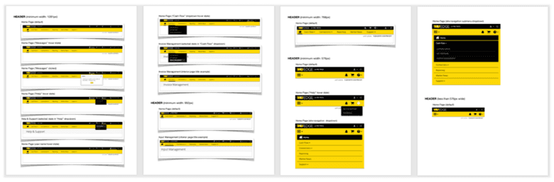
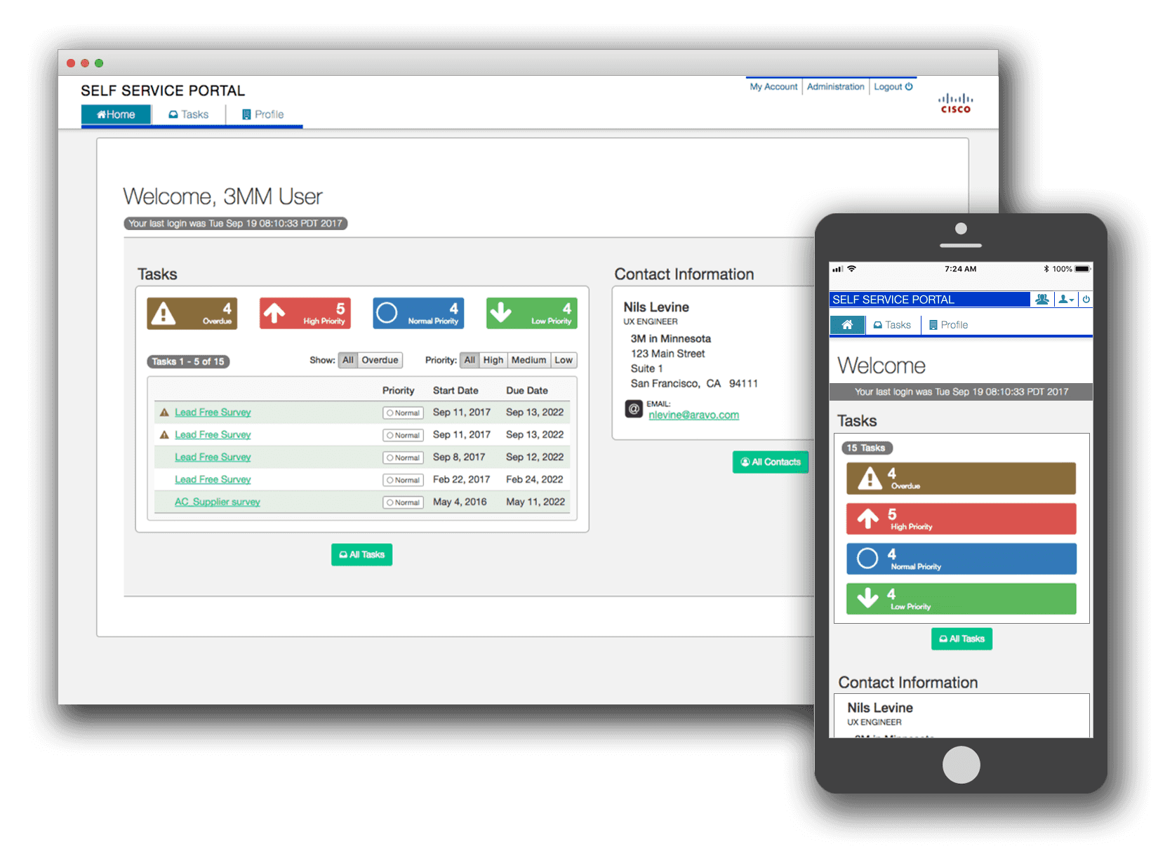
The first design decision involved breaking the navigation into two rows. This allowed more room for the main navigation items, and maintained a logical separation between site navigation and account-centric controls (the latter being messaging, pending orders, help, user settings, and logout).
Next came a recommendation from the global Digital Relationship Managers to include the users organization name in the header after they observed that there was now enough space for its display. At this point the final requirements were agreed upon to prevent scope creep.
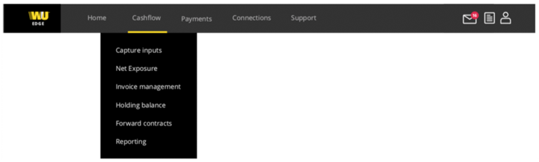
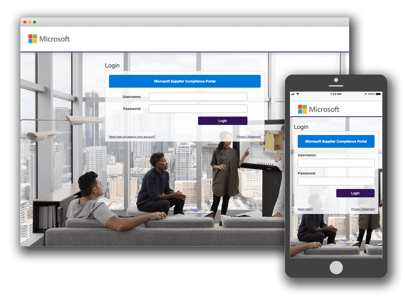
 The new design accommodates multi-lingual support.
I strongly recommended that the design not include a fixed number of navigation items, convincing stakeholders that I could provide a solution that would maximize the template's versatility.
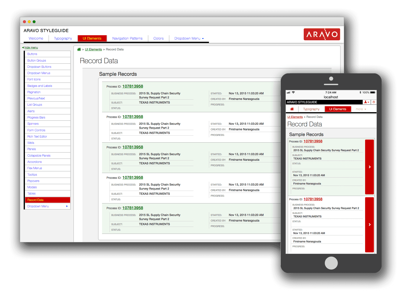
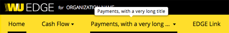 An example of how the new design can handle very long menu names (very helpful for multi-lingual support).
Results
The new navigation design was deployed to user-acceptance testing 90 days after I was hired, and after another 30 days a period that that included some bug fixes and refinements it was deployed to production.
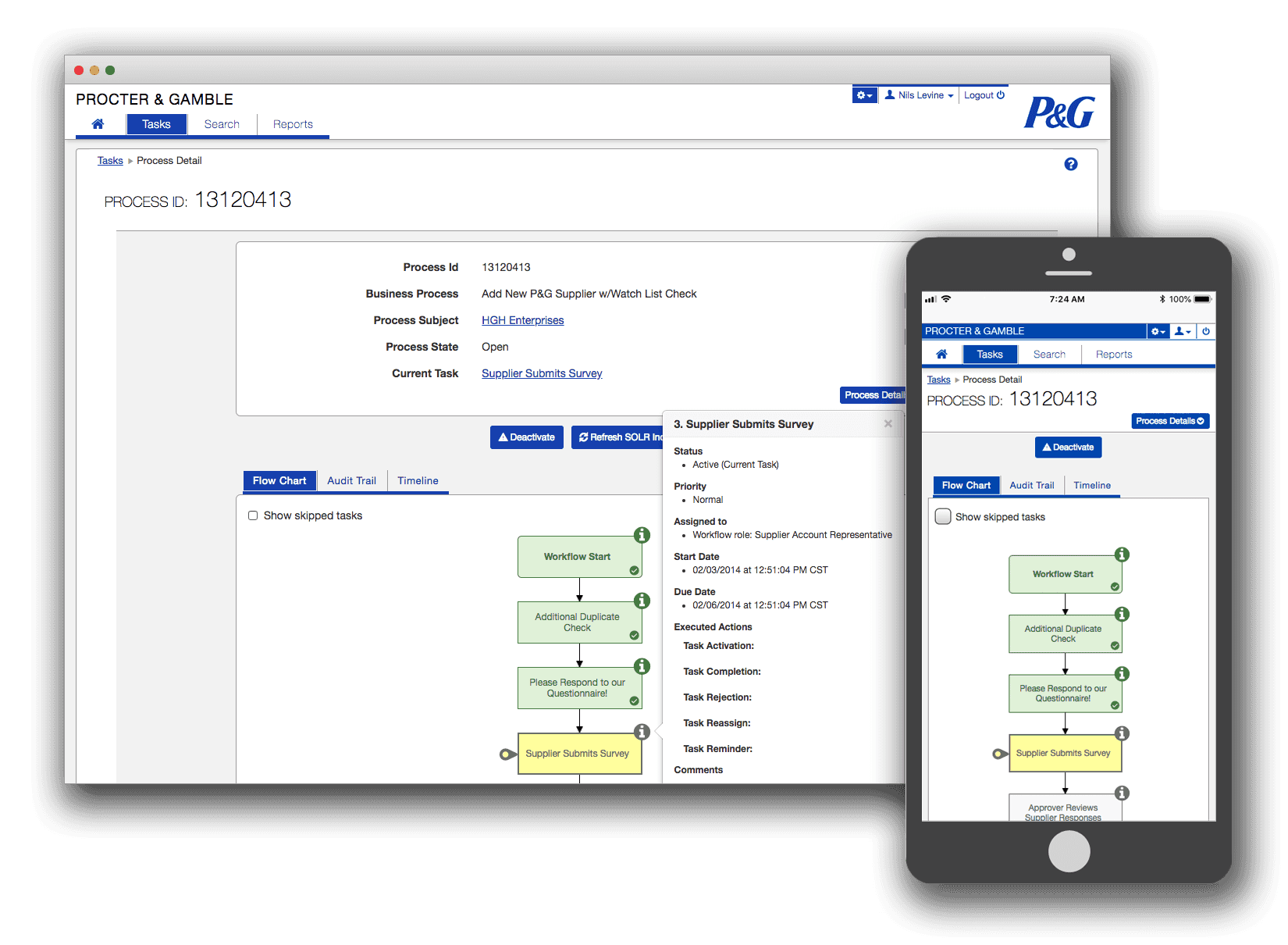
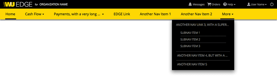 The new design accommodates a flexible number of navigation items.
Conclusions
I have both led and participated in several such redesign projects in my career. This background allows me to understand what can reasonably be achieved in a realistic time-frame with a very high level of confidence. My experience building extensible multi-lingual web templates provided me with the ability to deliver a well-regarded and much appreciated solution to a pressing issue in a relatively short time frame.
Beyond the specific design and technical challenges I handled in this exercise, I also proved I could take the lead on getting sign-off from other departments within Western Union: most notably Branding, Legal, and Information Security.
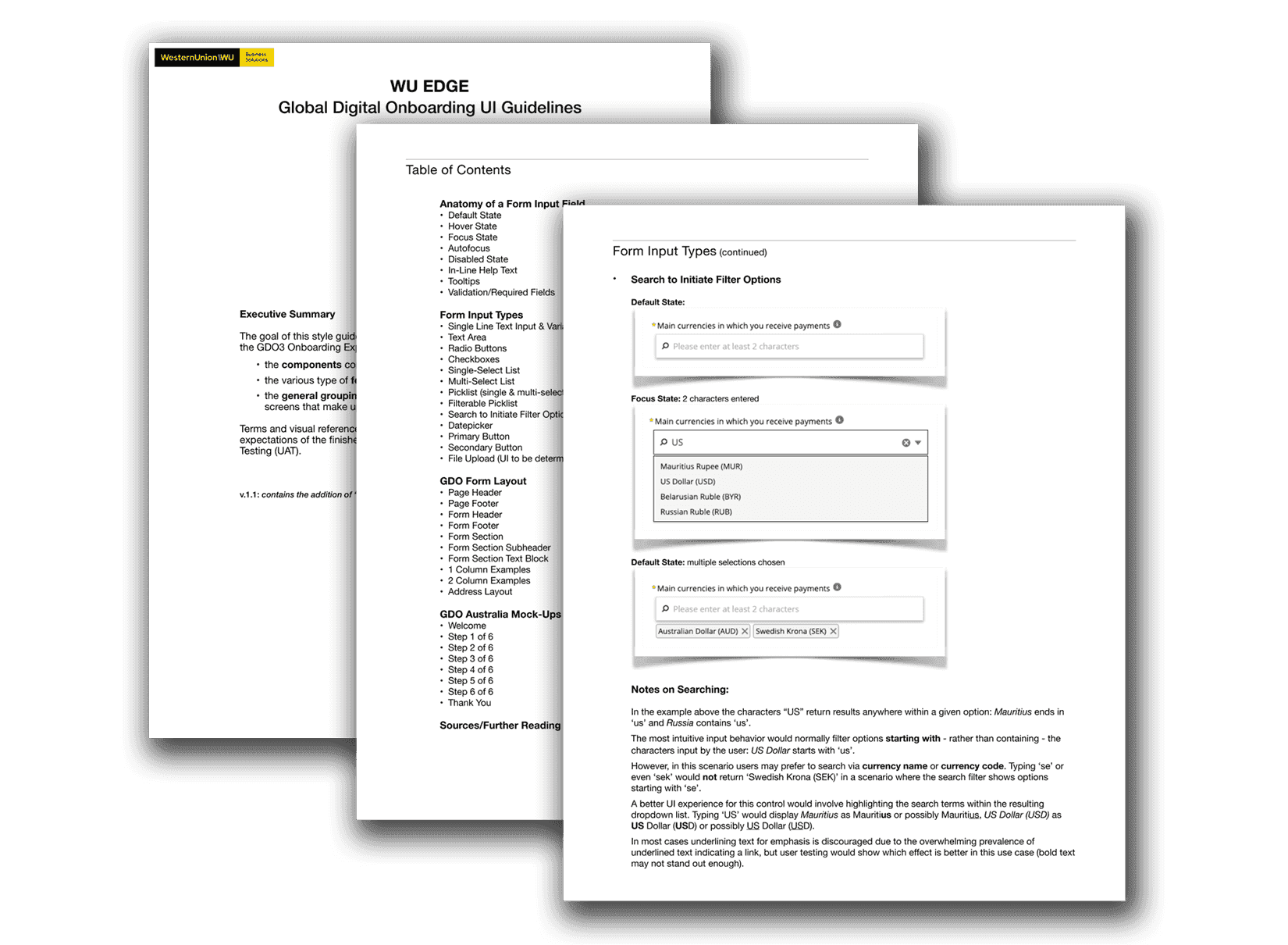
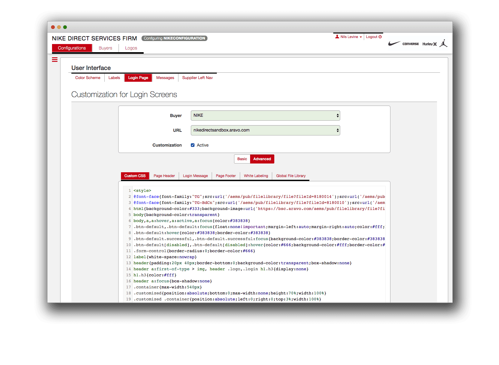
 A style guide provides support for acceptance criteria and user acceptance testing.
2012 – 2018Aravo Solutions
- Created the strategic UI/UX roadmap for ensuring seamless user experiences across the entire Aravo Enterprise Platform and advocated support for that vision across the organization.
- Led front-end coding efforts by developing and implementing a library of standardized UI components within an Agile/Scrum environment.
- Collaborated with in-house and customer configuration teams to implement complex UI customizations under aggressive scheduling constraints.
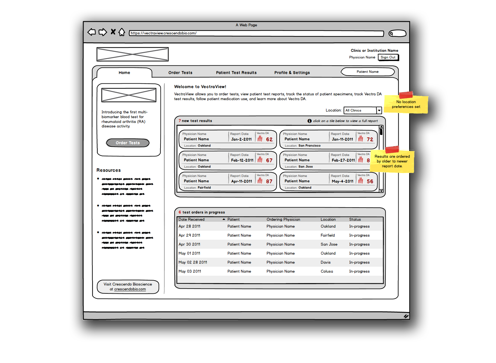
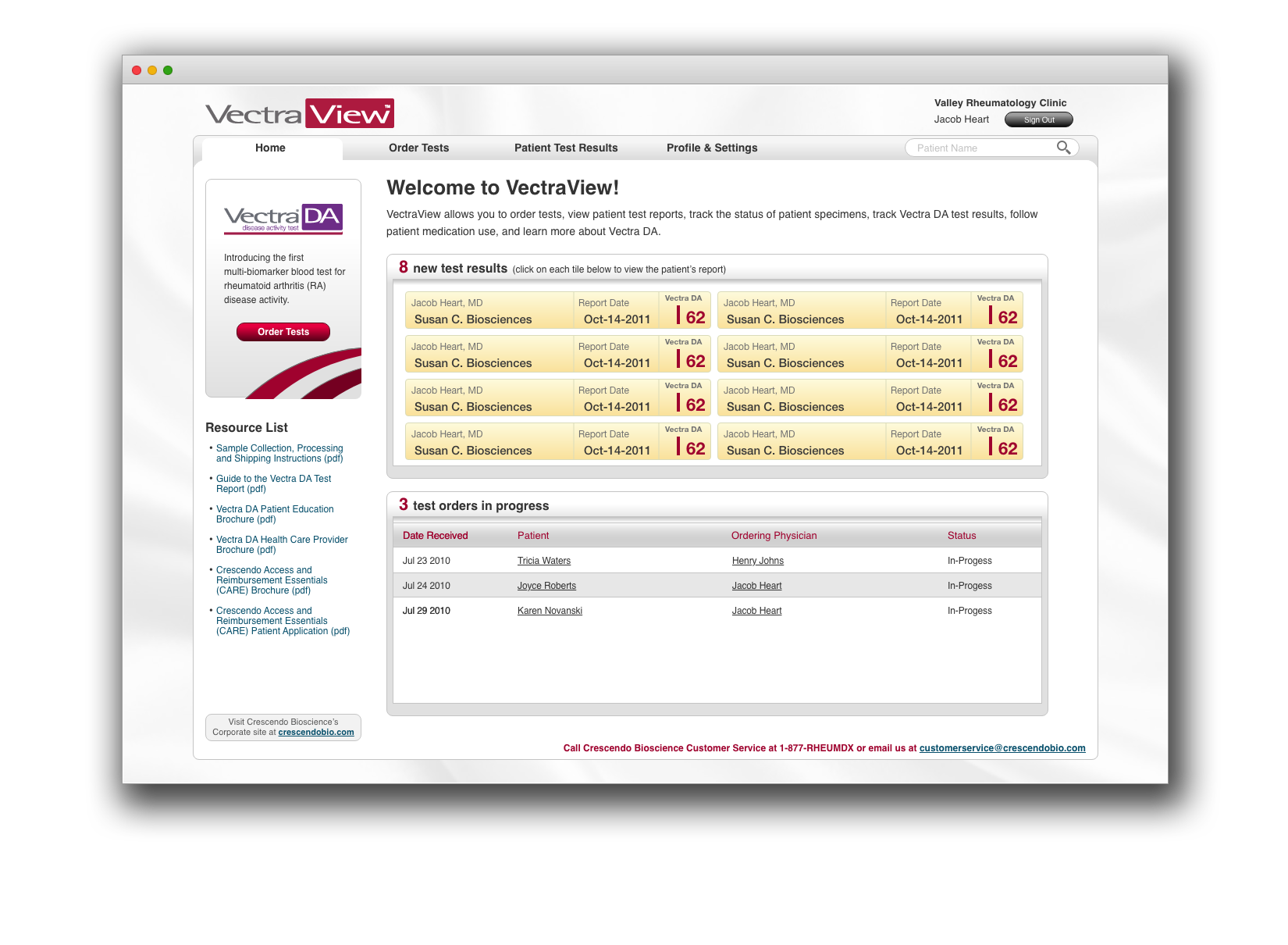
2010 – 2011Crescendo Biosciences
- Led the interaction/user experience design of a secure, online portal for physicians and staff to order, track, and review multi-biomarker blood tests.
- Transformed conceptual product vision into a commercial software application by developing requirements, use-case scenarios, and functional specifications in an agile software development environment.